
Have you ever struggled with color adjustments in Photoshop? If yes, you will surely be interested in Adobe’s recent revamp of Photoshop’s HSL adjustment tool. For years, adjusting hue, saturation, and lightness has meant turgid dropdown menus and sliders that never really told you what you were getting. Now no more!
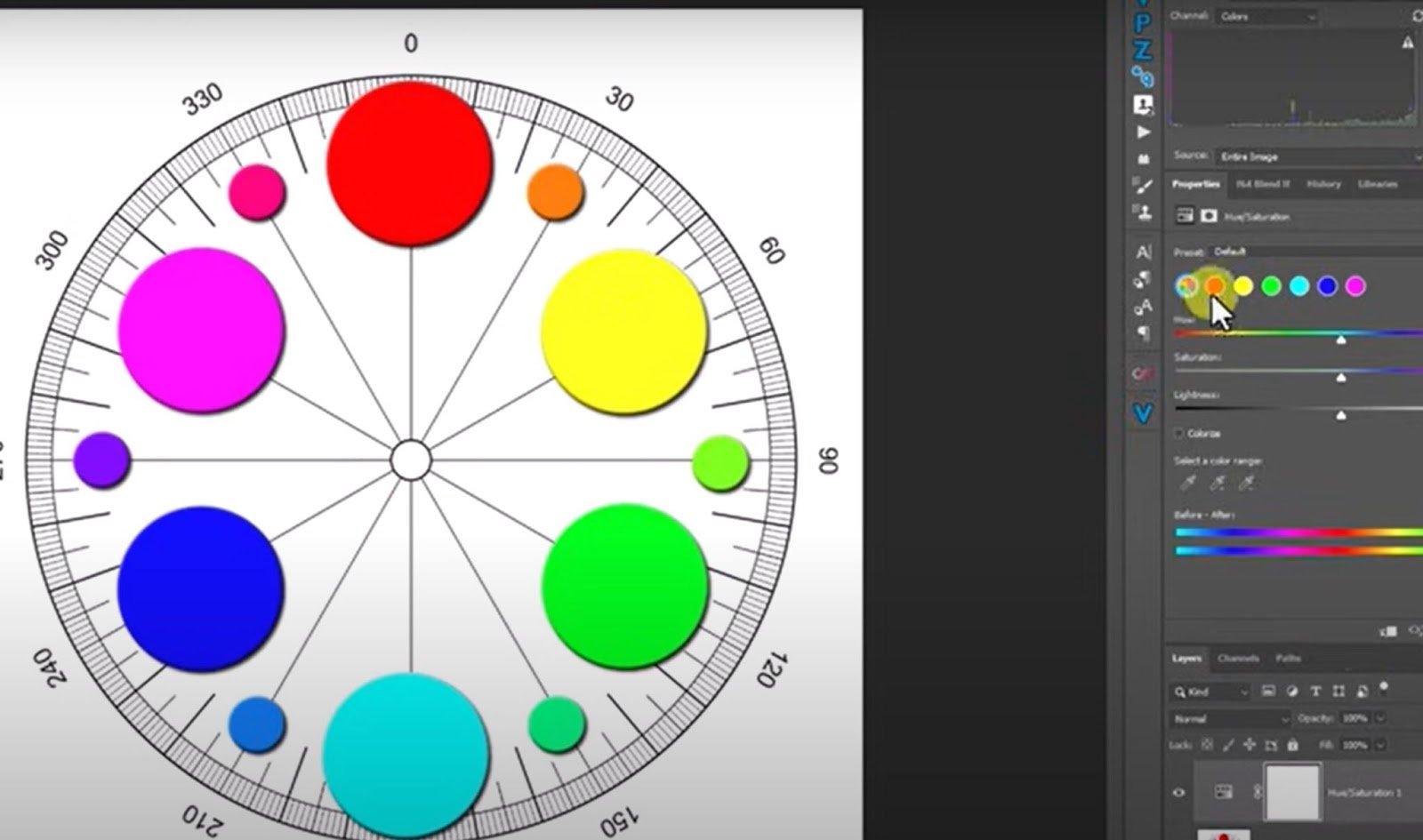
Adobe has redesigned the tool with a new visual organization based on a color wheel. It is already changing the way people work with color. No more drop-down menus; instead, you have tidy, color-coded circles that give instant visual feedback. This seems vital for routine workflows and creative decision-making.
In a step-by-step tutorial by Blake Rudis of f64 Academy the changes to Photoshop’s HSL adjustment are outlined in detail, with a warning about a bug present in version 26.6. If you have found that the HSL adjustment layer does not work from the classic adjustment menu, you are not dreaming. Blake describes an easy workaround to help you avoid the problem until Adobe addresses it. This is not merely a glitch notification; it is helpful advice that saves time, particularly in the middle of a project.
How Photoshop’s HSL Adjustment Tool Just Got More Intuitive?
But the updates extend beyond simply repairing the interface. The new “prominent colors” feature is an outstanding addition. Photoshop now detects the most prominent colors in your image automatically and lets you adjust them directly. You no longer need to depend on imprecise color categories.
Instead, a more accurately adjusted dropper tool allows you to isolate specific colors and change them in real time with much more accuracy. This provides another level of control and creativity that is more intuitive than technical. Blake also takes you through enhanced sliders that allow you to see exactly how colors shift as you make adjustments, so you can hone your edits without going too far.
One handy tip from Blake deals with saturation. It’s all too easy to turn up the heat, but inconsiderately doing so will destroy your image’s organic harmony. Instead, he recommends making minor saturation adjustments combined with brightness control.
This advice puts novice users at a different level than advanced amateurs who wish to refine their visual sensibilities. Another reminder that you must overlook is to open your Properties panel open during editing. That single step can significantly improve your color editing precision.
Final Thoughts
Seeing the disintegration of Photoshop’s HSL adjustment reminds me how frequently we use tools by habit. This update means reconsidering how we use color in general. The color wheel interface was like opening a window.
It is simpler to use, more responsive, and much more creative. It forced me to go back and look again at old revisions and tackle them with new eyes. Sometimes, a minor tweak unlocks an entirely new method of working.

[via Fstoppers; Image Credits: f64 Academy]
